Design your chatbot widget
The Widget Style page controls how your chatbot looks and behaves when visitors see it on your website. Open any…
The Widget Style page controls how your chatbot looks and behaves when visitors see it on your website. Open any bot and click Widget Style in the sidebar to access it.
The page is divided into two main sections — Widget Settings (behavior) and Style (appearance) — with a live preview on the right side. You can toggle the preview between Floating (chat bubble in corner) and Inline (embedded in page) modes.
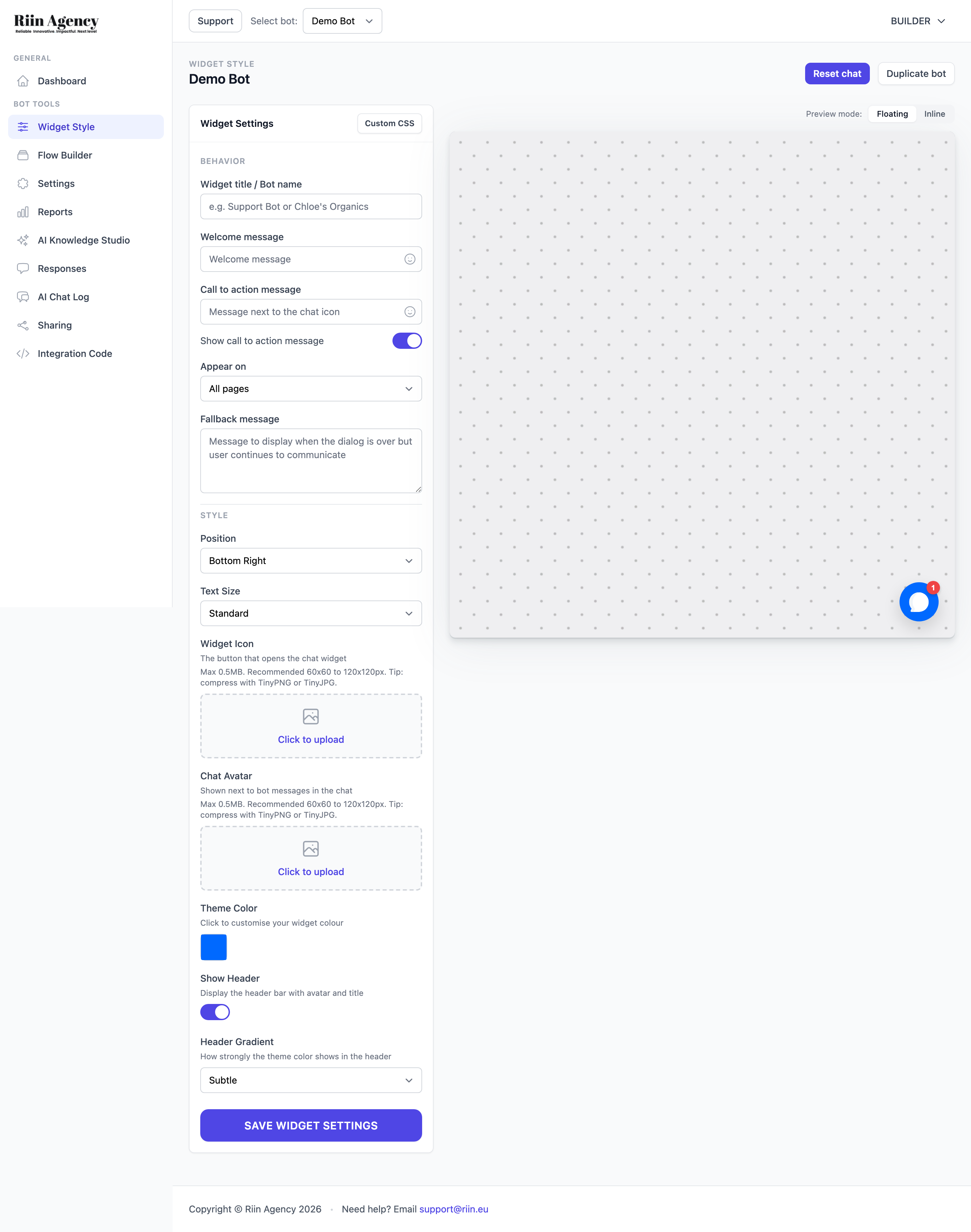
Widget Settings (Behavior)
These settings control what your bot says and when it appears:
- Widget title / Bot name — The name shown in the chat widget header. This is different from the internal bot name on your dashboard.
- Welcome message — The first message your bot shows when a visitor opens the chat. Supports emojis.
- Call to action message — A short text that appears next to the chat icon to encourage visitors to click. You can toggle this on or off with the Show call to action message switch.
- Appear on — A dropdown that controls where your bot appears: All pages or specific pages only.
- Fallback message — The message shown when the conversation flow is over but the visitor continues to type.
Style Settings
These settings control the visual appearance of your chat widget:
- Position — Choose where the chat widget appears on your page (e.g., Bottom Right, Bottom Left).
- Text Size — Set the text size for messages in the chat (Standard or other options).
- Widget Icon — Upload a custom image for the floating chat button that visitors click to open the chat. Recommended size: 60×60 to 120x120px, max 0.5MB.
- Chat Avatar — Upload an image shown next to the bot’s messages inside the chat. Same size recommendations as the widget icon.
- Theme Color — Click the color swatch to customize your widget’s main color. This affects the header, buttons, and other accent elements.
- Show Header — Toggle the header bar on or off. When enabled, the header displays the avatar and bot title at the top of the chat window.
- Header Gradient — Controls how strongly the theme color shows in the header background (e.g., Subtle, Strong).
Preview
The right side of the page shows a live preview of your widget. Use the Floating and Inline tabs at the top of the preview to see how your bot will look in each mode. The preview updates in real time as you change settings.
You’ll also find a Reset chat button (clears preview conversation) and a Duplicate bot button at the top of the page.
When you’re happy with the design, click SAVE WIDGET SETTINGS at the bottom of the page.