
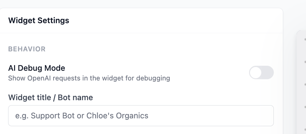
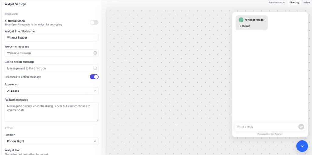
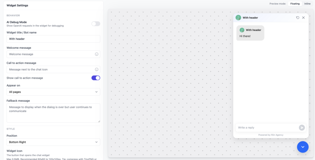
The Widget Settings control how your chatbot looks and how it appears to visitors on your website.
This is a safe place to start. You don’t need to change everything.
Widget title / Bot name
This is the name shown inside the chat window.
Good examples:
- Support Bot
- Website Assistant
- Ask us anything
Keep it short and friendly.
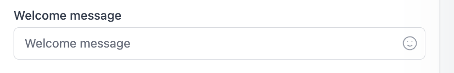
Welcome message
This is the first message users see when they open the chat.
Good welcome messages:
- Hi! 👋 How can I help you today?
- Need help? I’m here to answer your questions.
- Hello! Ask me anything about our services.
Avoid long explanations. One sentence is enough.
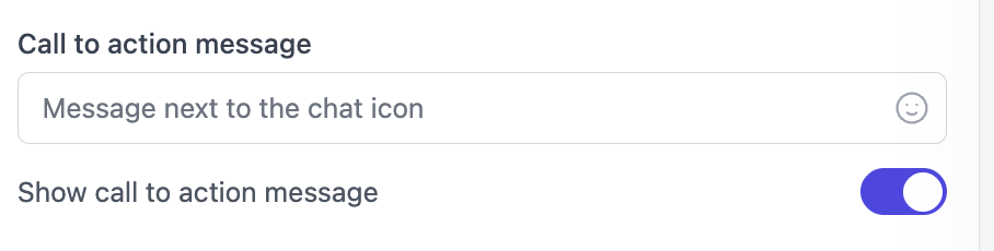
Call to action message
This message appears next to the chat icon before the user opens the chatbot.
Its goal is to encourage users to click.
Good examples:
- Need help?
- Questions? Chat with us
- Ask us anything
If you don’t want this message, you can turn it off.
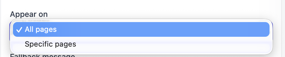
Appear on
This setting controls where the chatbot appears.
- All pages – recommended for most users
- Specific pages – useful for landing pages or checkout pages
If you’re unsure, leave this set to All pages.
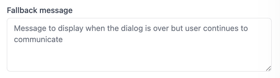
Fallback message
This message is shown when the conversation ends but the user continues typing.
Example fallback messages:
- I’m not sure I understood that. Can you try again?
- Please choose one of the options above.
This helps prevent dead ends in the conversation.
Style settings
The Style section controls how the chatbot widget looks on your website (colors, icons, and placement).
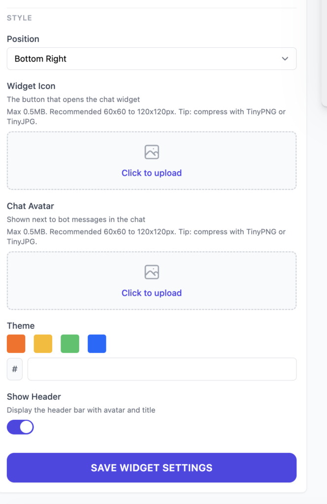
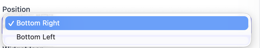
Position
This controls where the chat icon appears on the website.
- Bottom Right – most common choice (recommended)
- Bottom Left – good if your site already has buttons on the right
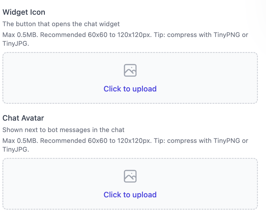
Widget icon
This is the button visitors click to open the chat.
Most commonly used icons:
- A chat bubble icon
- Your company logo
- A person or avatar image (support agent, assistant, etc.)
Fun fact: you can also upload a GIF. Animated icons often attract more attention and increase chat opens.
- Recommended size: 60×60 to 120×120 px
- Maximum file size: 0.5 MB
- Keep the design simple and high-contrast
Chat avatar
This avatar is shown next to bot messages inside the chat.
- Recommended size: 60×60 to 120×120 px
- Keep the file under 0.5 MB
- A logo or friendly face works best
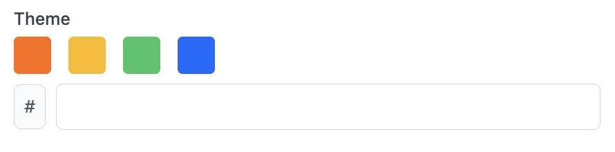
Theme color
This controls the main color of the chat widget.
- You can select one of the preset colors
- Or enter your brand color using a hex code (for example:
#f4f7fc)
Tip: choose a color that matches your website buttons or brand style.
Show Header
This setting shows a header bar inside the chat (usually including the title and avatar).
- On – recommended (looks more professional)
- Off – useful if you want a minimal chat design
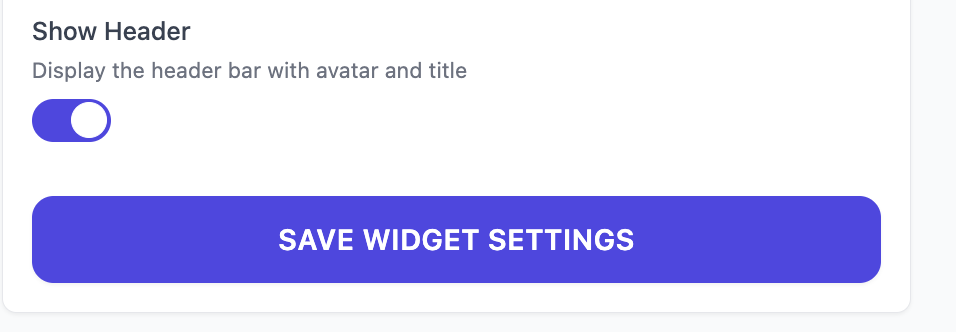
Save your changes
When you are done, click Save Widget Settings.
If you don’t click save, your changes will not be applied.